Brand Design
好穗成雙 – 小農品牌視覺設計
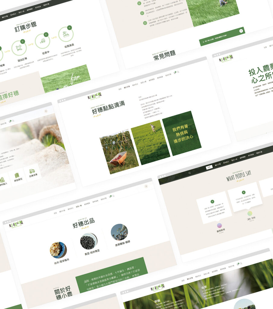
About
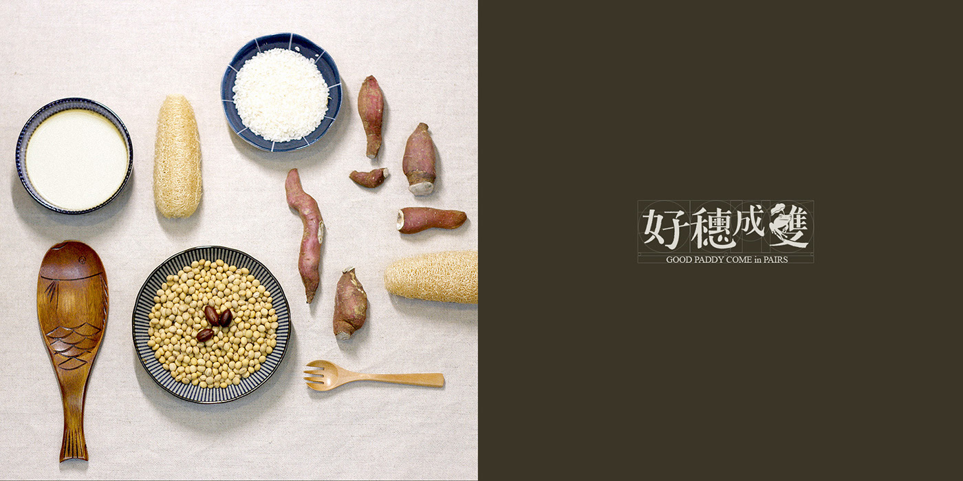
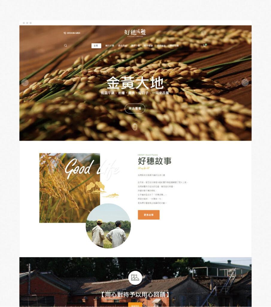
Good Paddy Come in Pairs is located in Pingzhen, Taoyuan, Taiwan, founded by local young farmers who utilized surrounding farmland and discovered suitable cultivation methods, realizing an ideal symbiotic cycle between their aspirations and the environment.Their regular crops include rice, black beans, and seasonally adjusted crops like sorghum, corn, roselle, etc. The brand also integrates food and farming education through DIY workshops for black bean tofu, promoting an educational journey from the origin to the dining table.
Design Concept
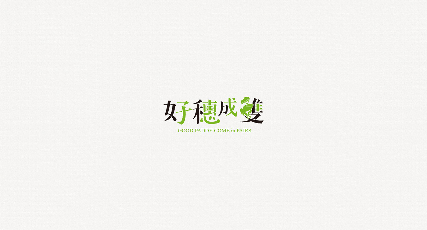
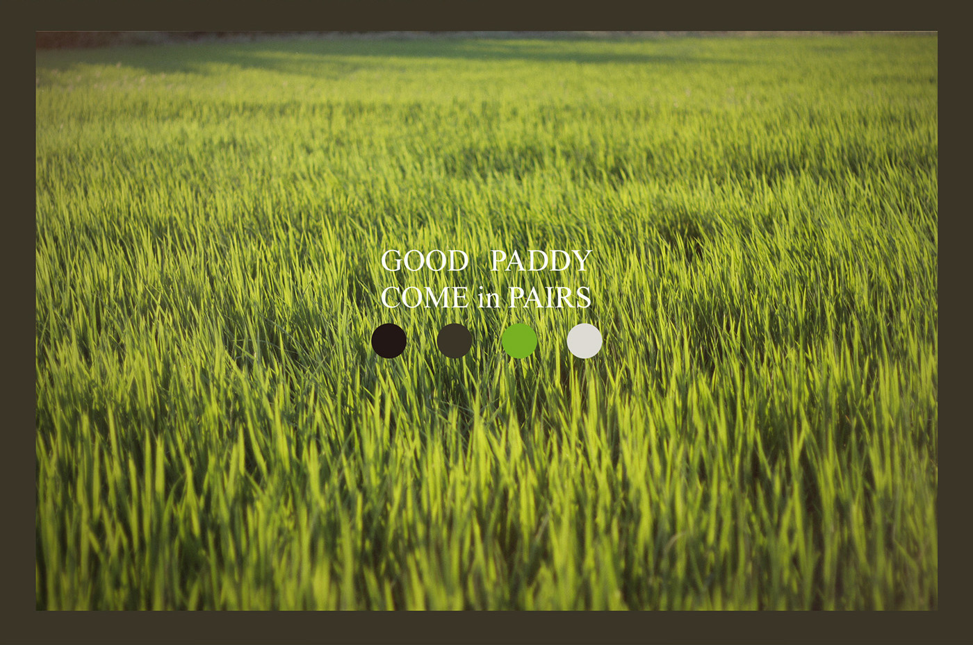
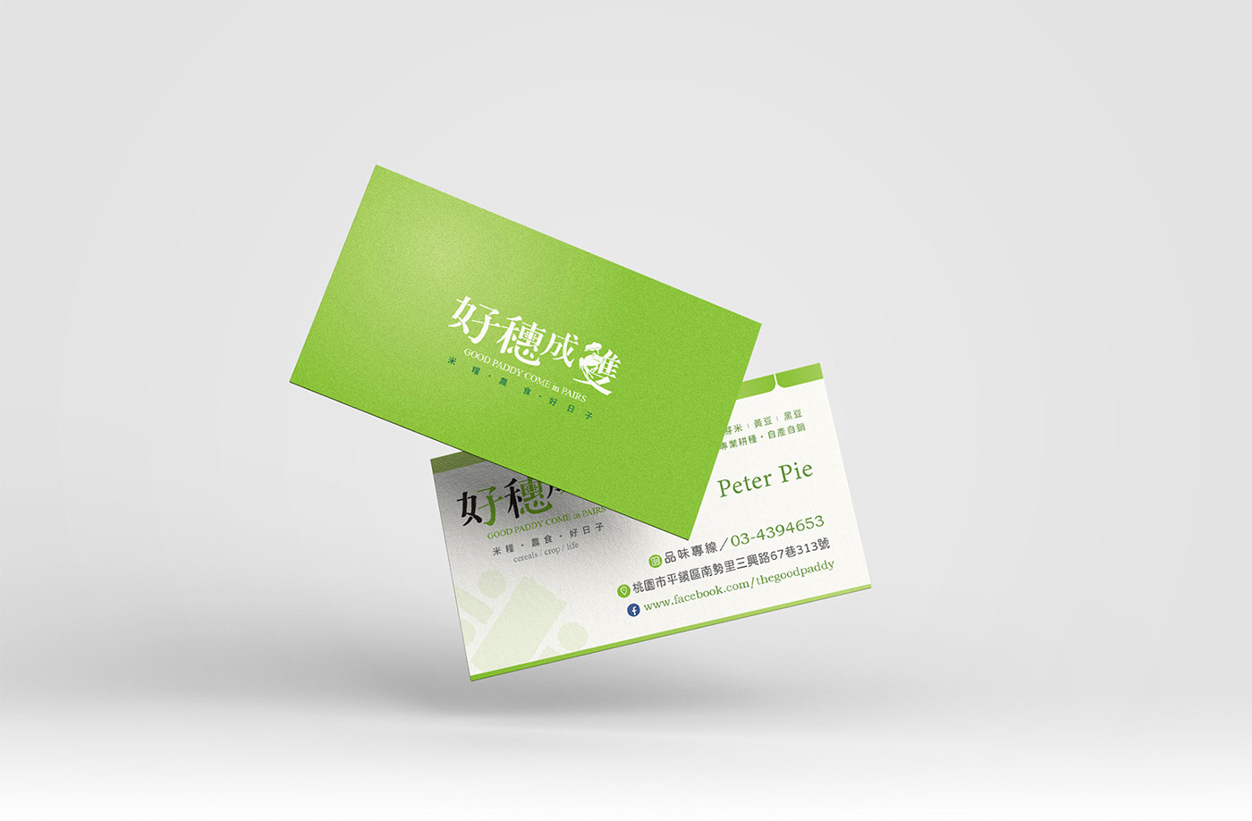
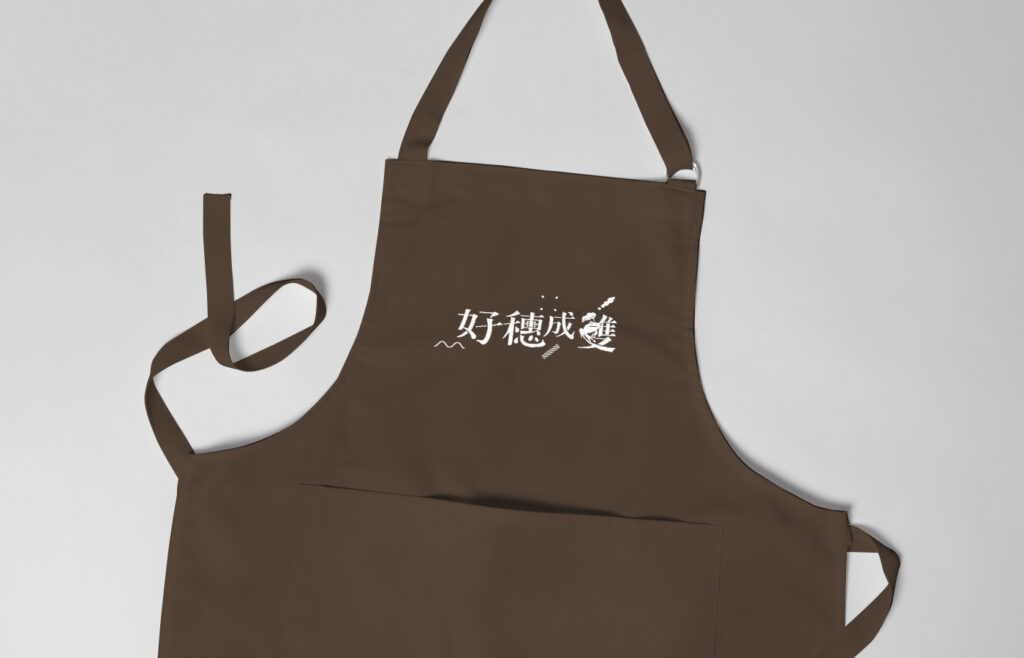
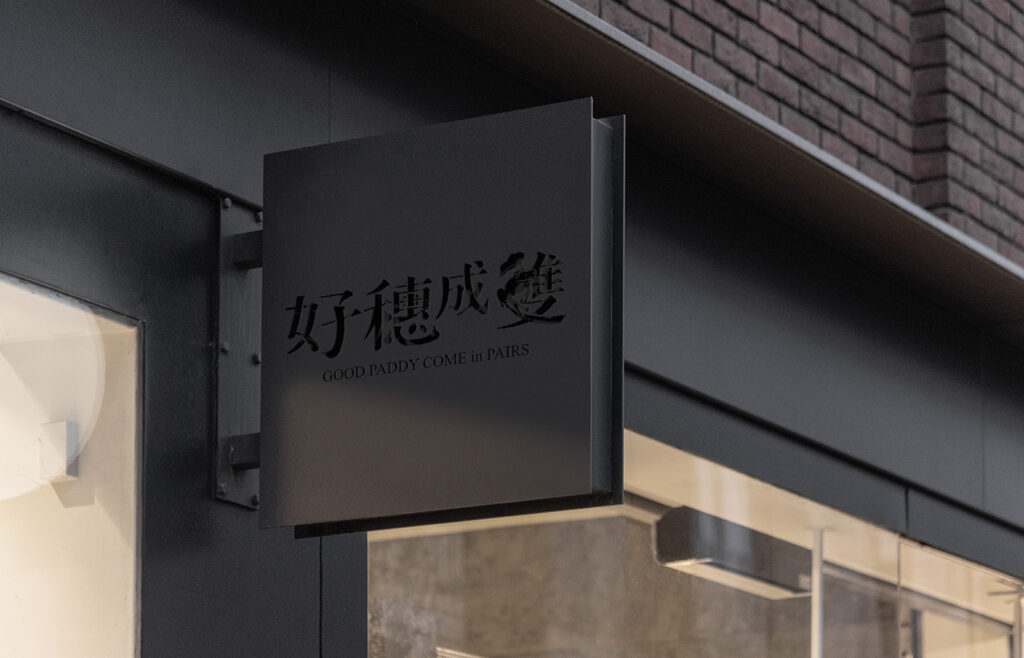
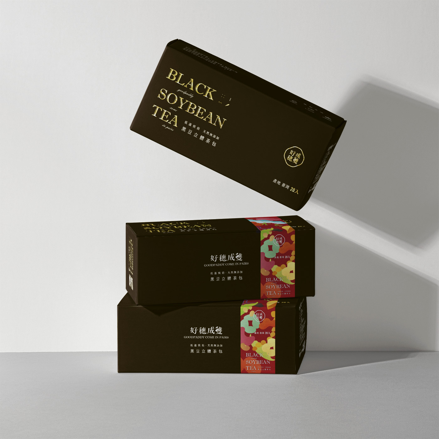
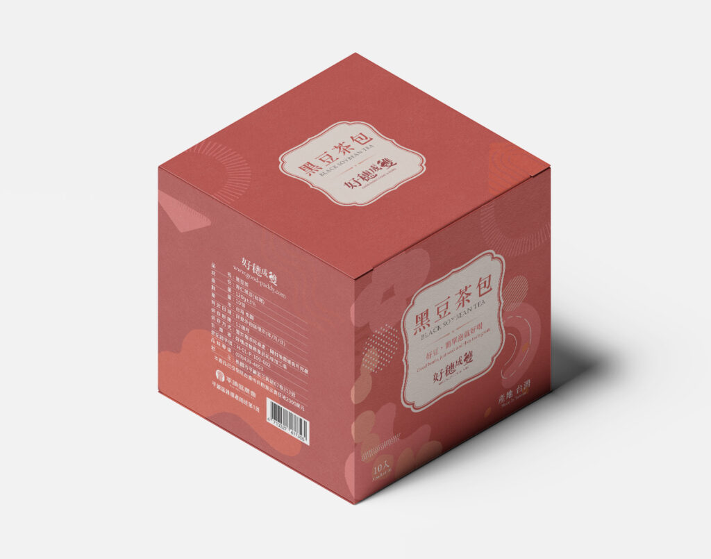
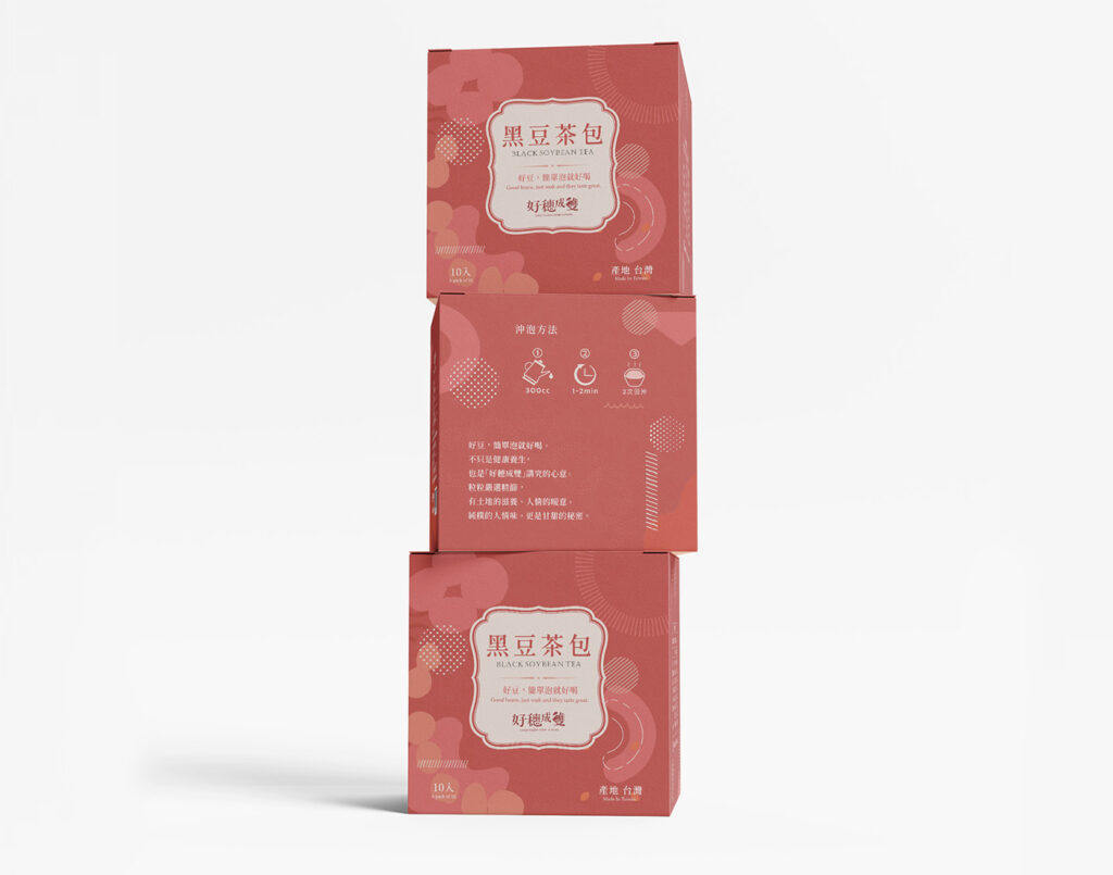
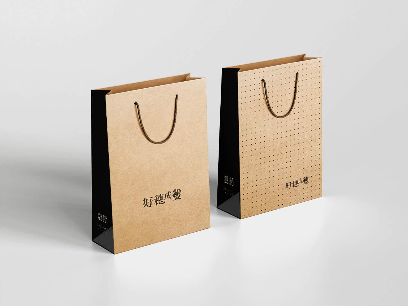
Good Paddy Come in Pairs is a brand that specializes in quality small items, showcasing the concept of “exquisite yet simple” through its image. The overall color scheme is harmoniously balanced, avoiding excessive contrasts to maintain a cohesive visual appeal. The brand logo features handwritten Chinese characters and incorporates the common field element of a frog, creating a unique and auspicious mascot with symbolic significance.
關於
好穗成雙位於台灣桃園平鎮,是由在地人家青年農民發跡,由自身發起將周邊農地活用並找到適合的耕作方式,實現理想與環境共生的循環模式。
常態農作有稻米、黑豆以及季節性調整作物,如高粱、玉米、洛神等;品牌亦結合了食農教育黑豆腐DIY手作課程,實現由產地到餐桌的教育思維。
設計理念
好穗成雙是一個以質感小品為特色的品牌,透過其形象展現了「精緻且簡單」的意境。整體的配色設計和諧均衡,不過於突兀,以保持整體視覺的和諧感。品牌標誌中選用了手寫明體字體,並融入了田野常見的青蛙元素,將其打造成了一個獨特而具有吉祥寓意的吉祥物。