Brand Design
Toughness 品牌設計
About
Toughness is a trusted financial consulting firm renowned for its professional and comprehensive financial services. With a team of experts and personalized career financial planning, Toughness is dedicated to providing clients with the best individual and lifelong family financial planning, crafting tailor-made financial strategies for clients.
Design Concept
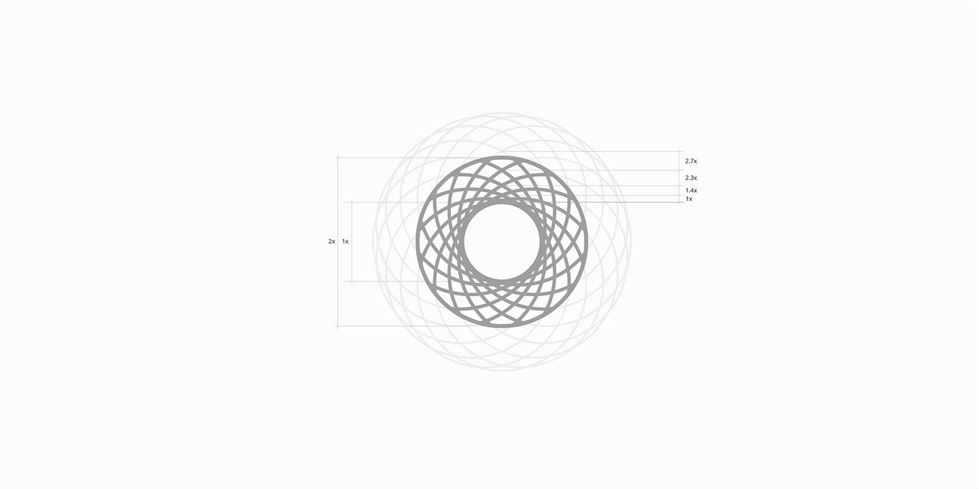
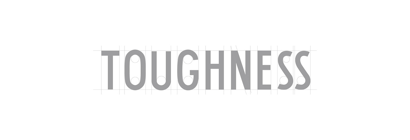
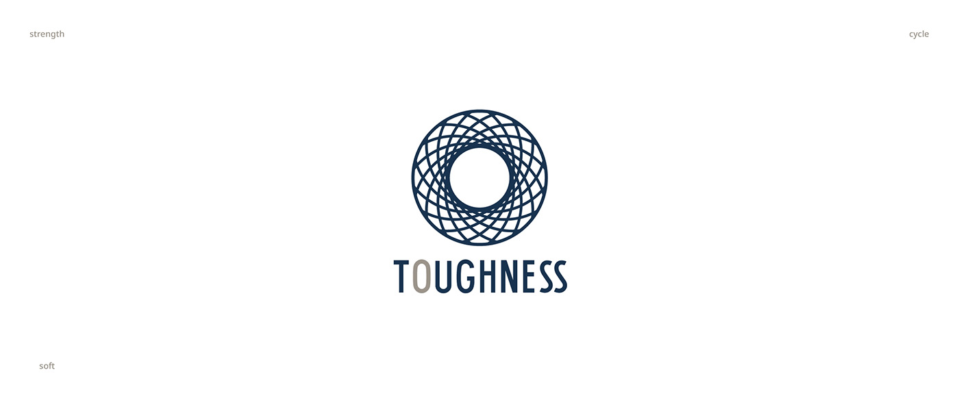
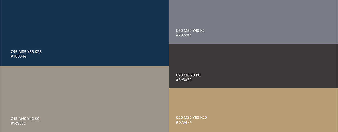
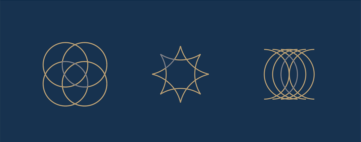
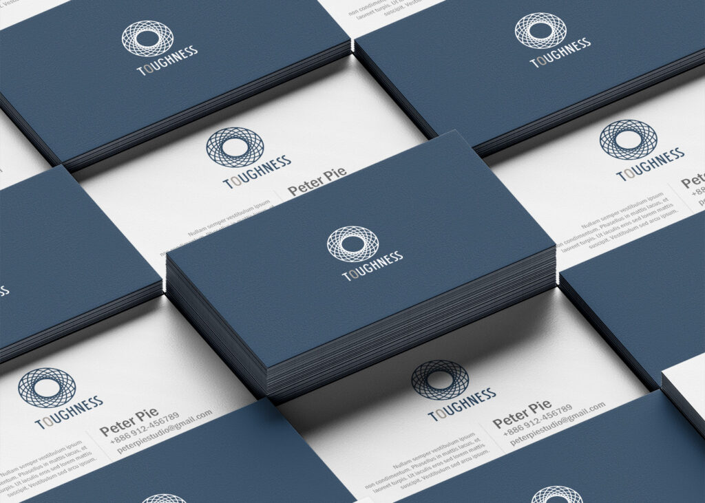
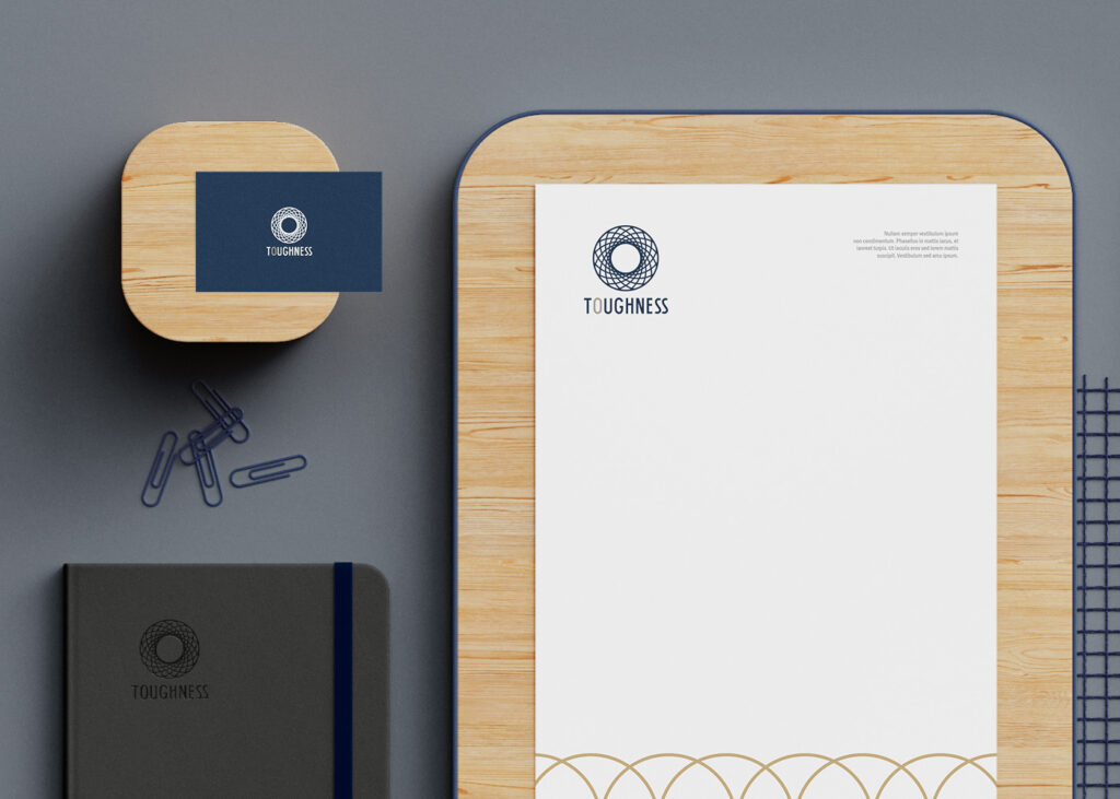
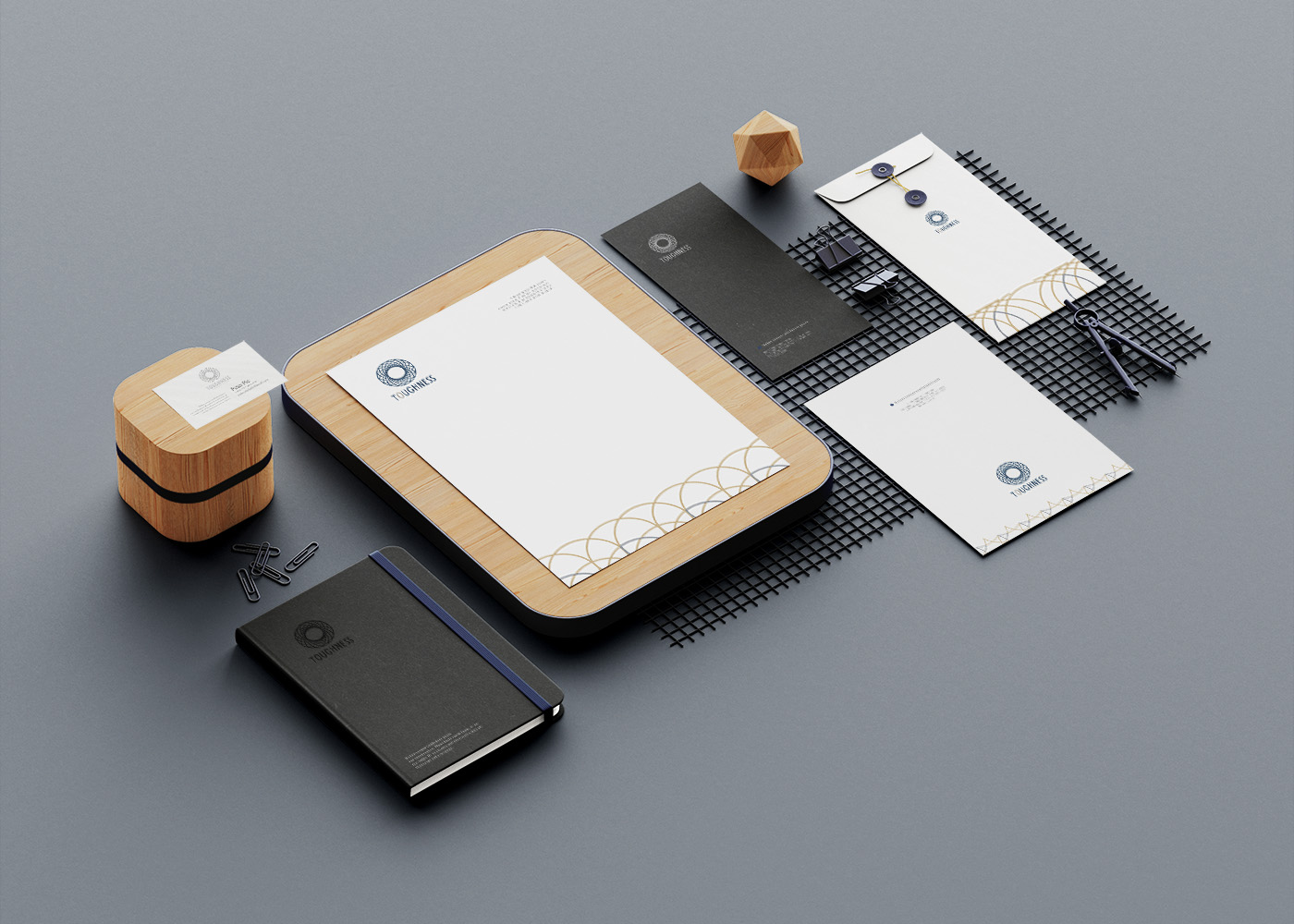
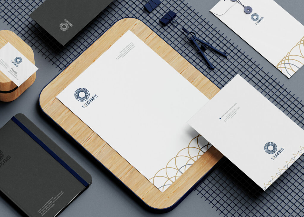
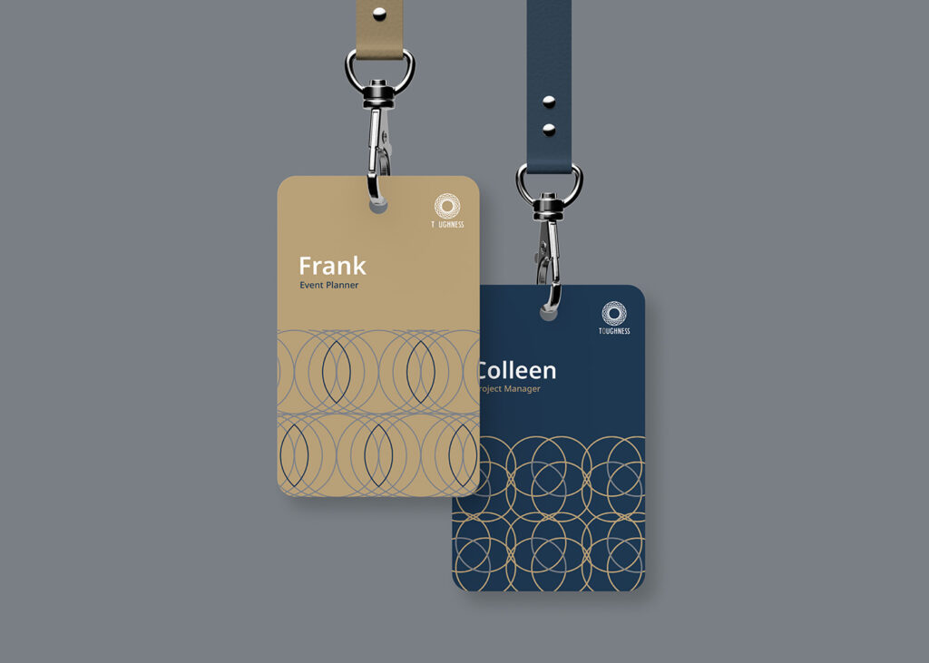
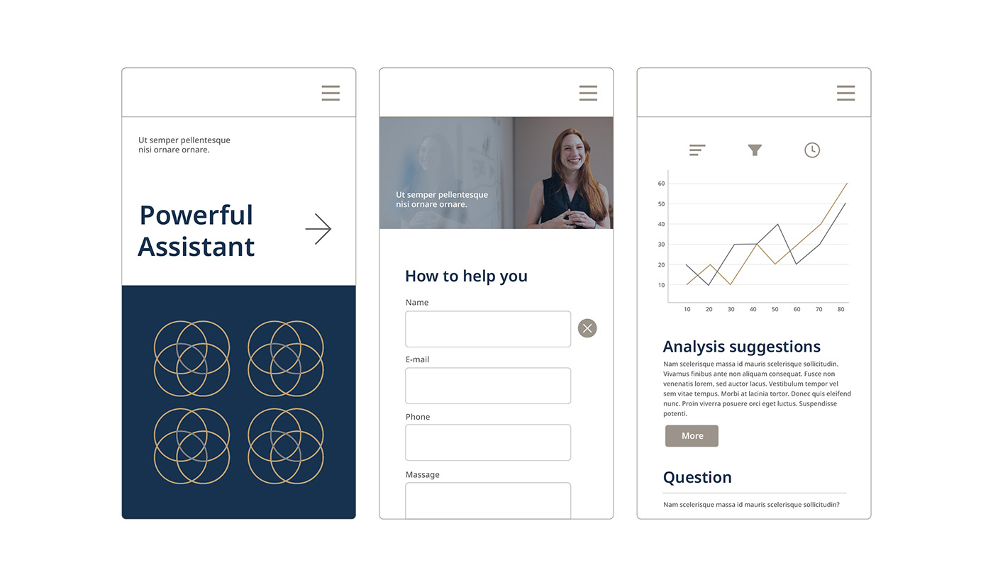
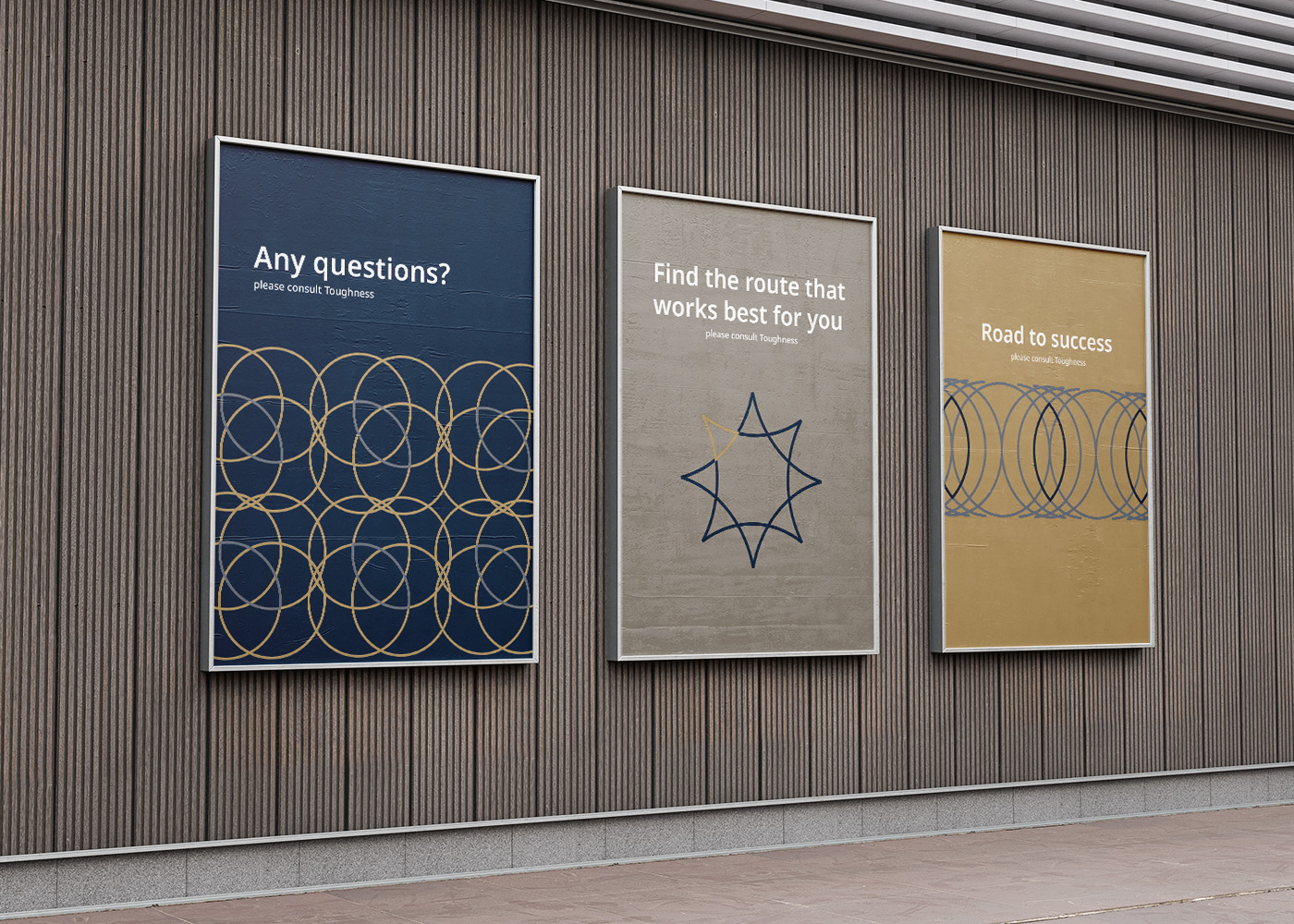
To showcase the professional and trustworthy image of Toughness, the logo incorporates a concept of global inclusiveness and thoroughness. The primary color palette features a deep blue tone, expressing a stable and rational corporate image, complemented by gold and gray to symbolize service quality. The design emphasizes attention to detail, highlighting professionalism while demonstrating a commitment to the financial security of clients. This visual identity not only reflects the company’s resilient character but also emphasizes its global and high-quality financial services.
關於
Toughness是一家值得信賴的顧問理財公司,以其專業而全面的理財服務而聞名。擁有專業的知識團隊以及一對一的生涯理財規劃服務,致力於為客戶提供最佳的個人及家庭全生涯理財規劃,為客戶制定度身定制的理財策略。
設計理念
為了呈現Toughness的專業與令人信賴的形象,商標融入了全球化無死角、面面俱到的構想。主基調選用暗藍色,表現沉穩、理性的企業形象,再以金色、灰色象徵它的服務品質。設計上注重細節,使整體風格突顯專業感,同時展現對客戶財務安全的承諾。這個視覺形象不僅體現了公司的堅韌性格,更突顯了其全球性且高品質的理財服務。